Bristol Bay Native Corporation
Case Study
After BBNC broke into the list of Alaska’s top 49ers and entered the ranks of billion dollar companies, they determined a need for a polished corporate brand reflecting their position in a global marketplace. They put our firm and a few others to work on designing a new logo, but success was elusive until Walsh|Sheppard convinced BBNC that before you can develop the right logo icon, you need a clear understanding of what the new logo should represent. This led to the search for BBNC’s Brand DNA and the award-winning logo they have today.
2011 > Brand Discovery Workshop > Preliminary Report > Brand DNA Identified > 2012 Brand Concepts, Fonts, Color Palette
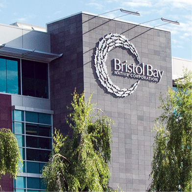
The “Circle of Life” logo serves as the center of BBNC’s brand identity system. Like the three cultures that are linked together by BBNC, it tells three stories. “The Three Life Stages of Salmon,” “The Nature and Mission of their Corporation,” and “Fish First — For Us, Our State, the World.”

Storytelling is part of who they are and an important part of their heritage, and we can best share the layered meanings of their logo through the development of their three stories invoked in a single iconic logo.
Bristol Bay has been called home for three Native cultures for roughly 10,000 years and is home to the world’s largest wild sockeye salmon fishery. Bristol Bay residents and descendants have a profound commitment to“Fish First.” The circle formed by the fish in the logo we developed represents completeness, wholeness, inclusiveness, and perpetuity. The number three runs deep in BBNC’s corporate DNA and is symbolized by three colors—salmon, silver, and blue. We aptly named their logo “The Eternal Circle of Life.”
